Modernizing a 300+ Member Brewers Guild
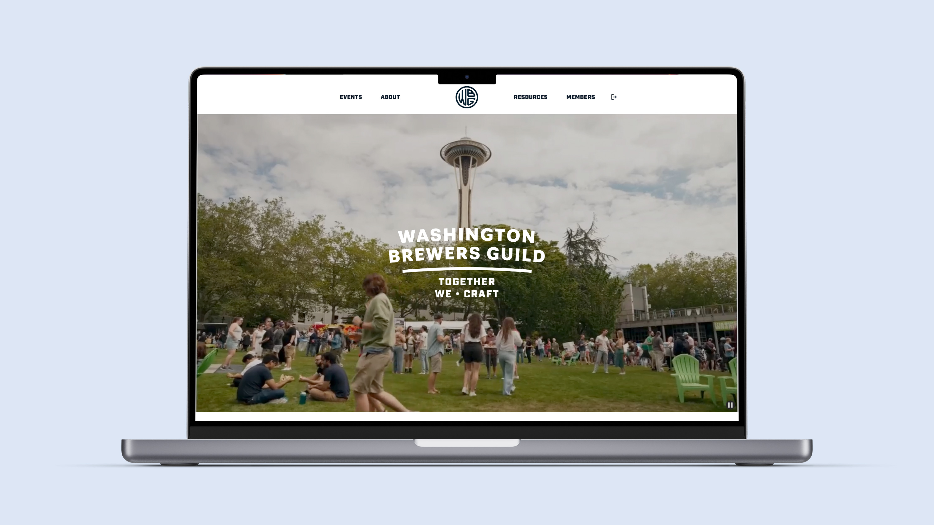
Washington Brewers Guild
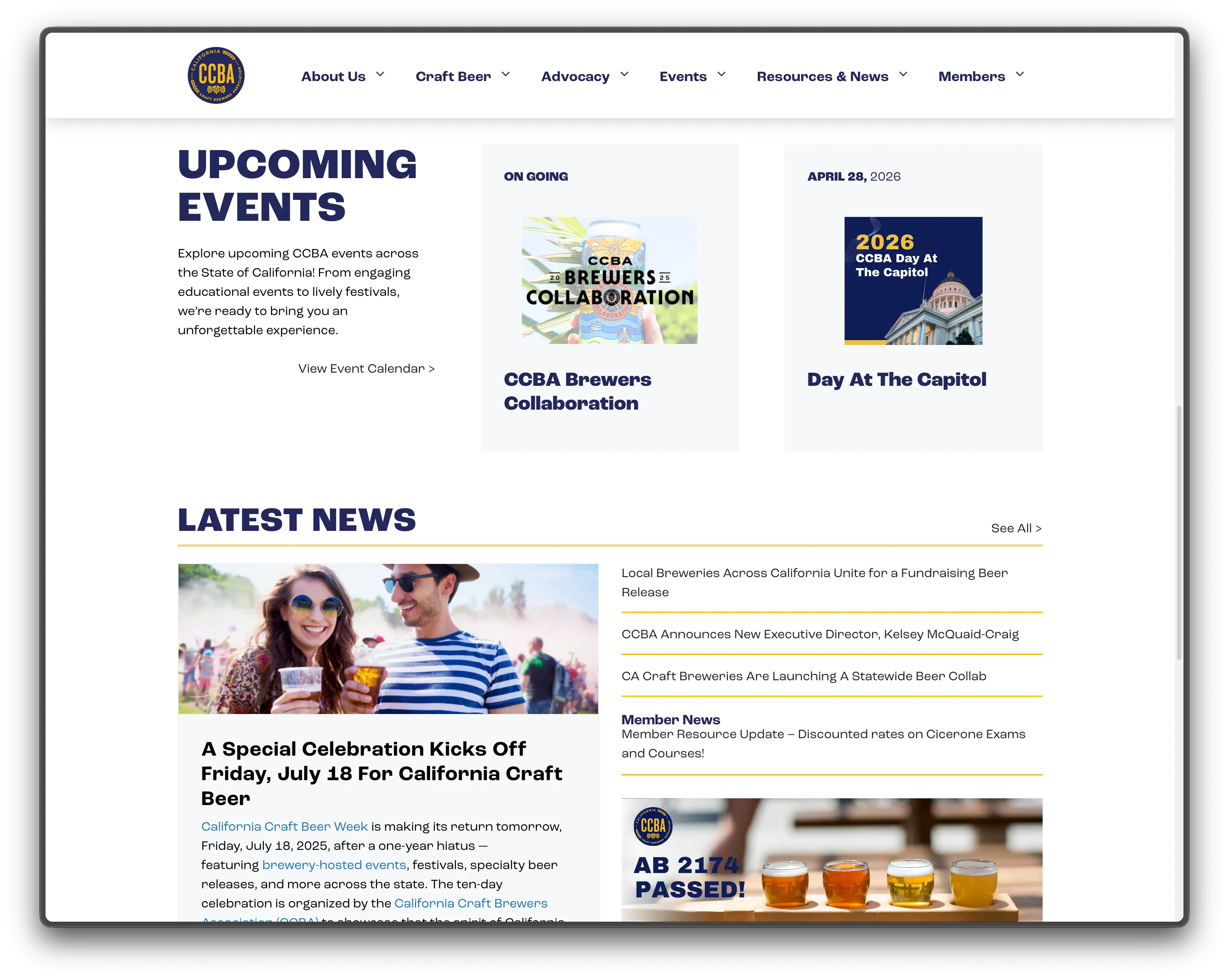
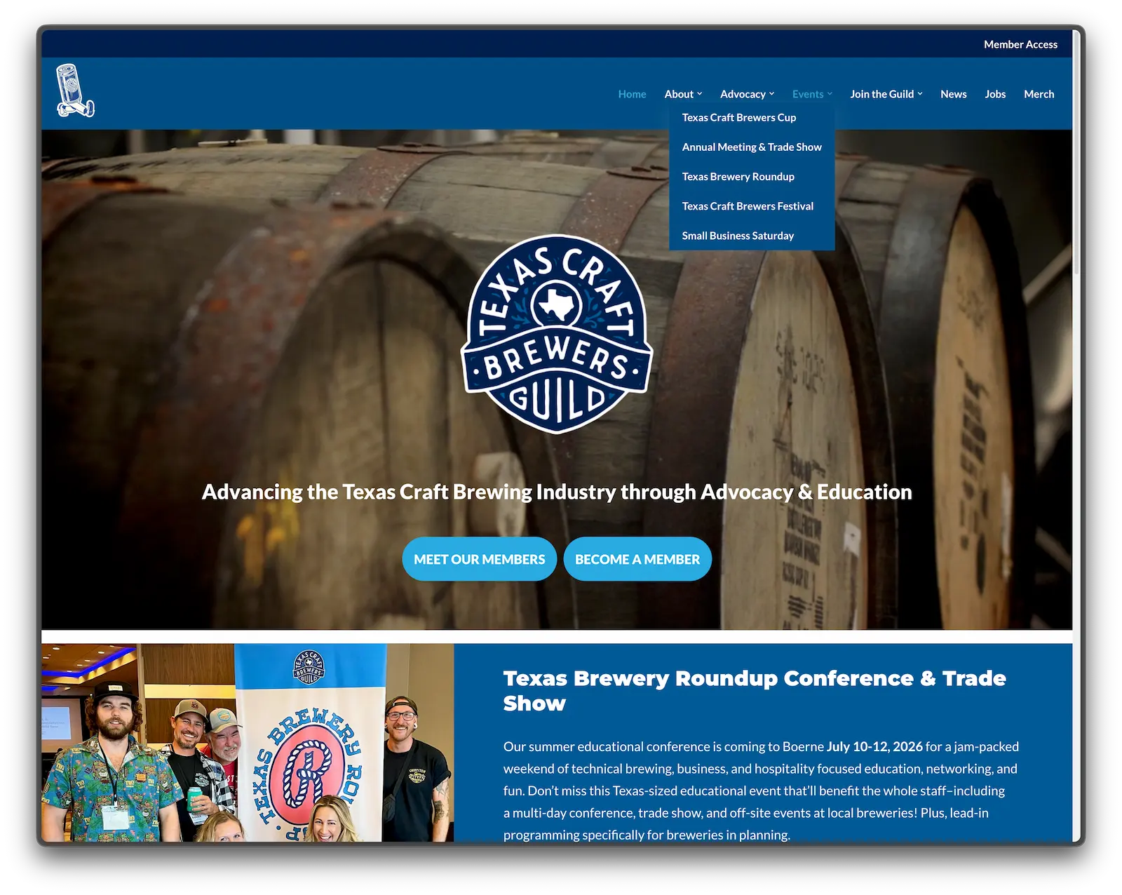
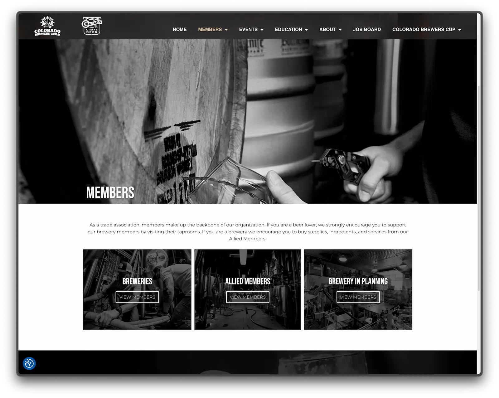
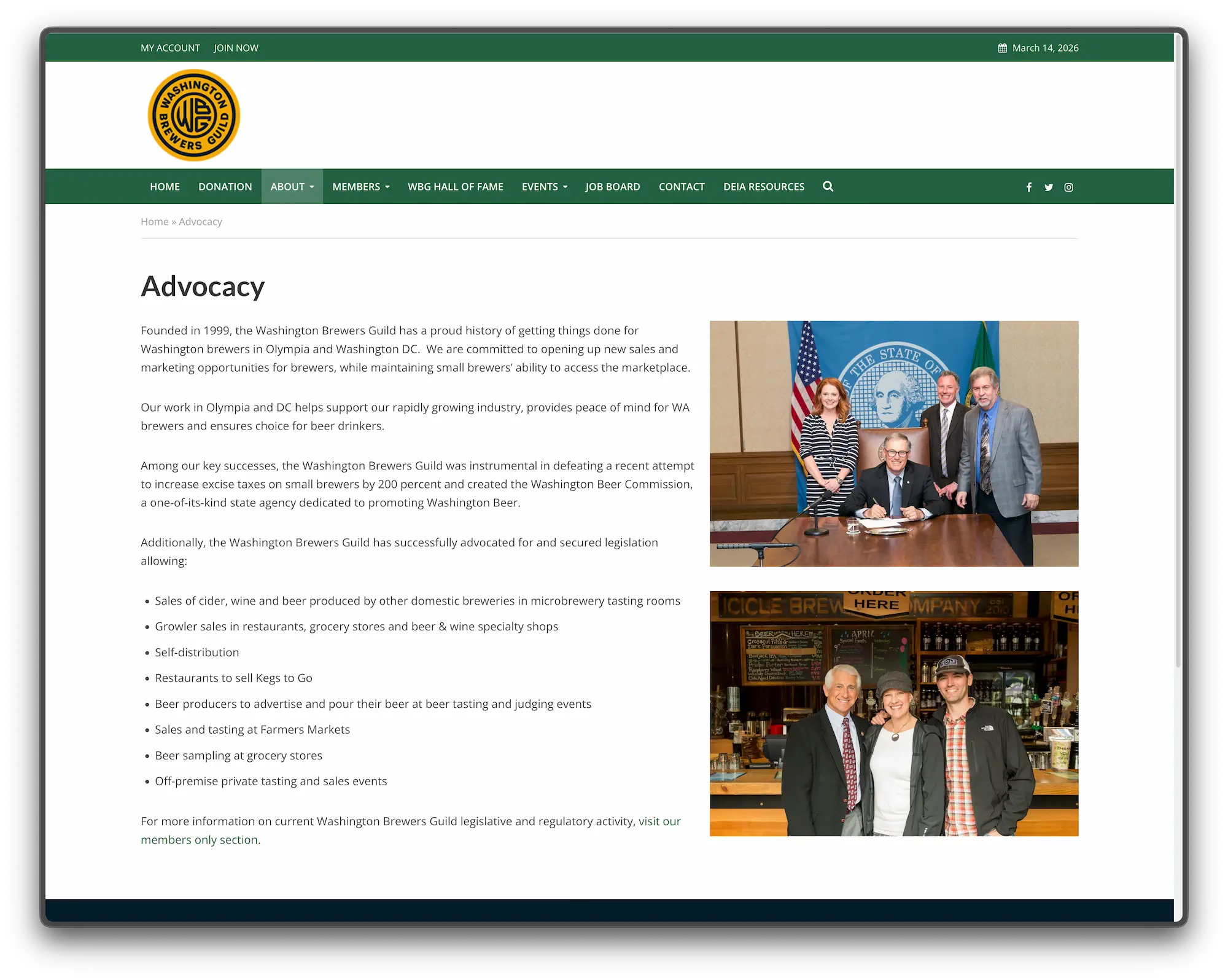
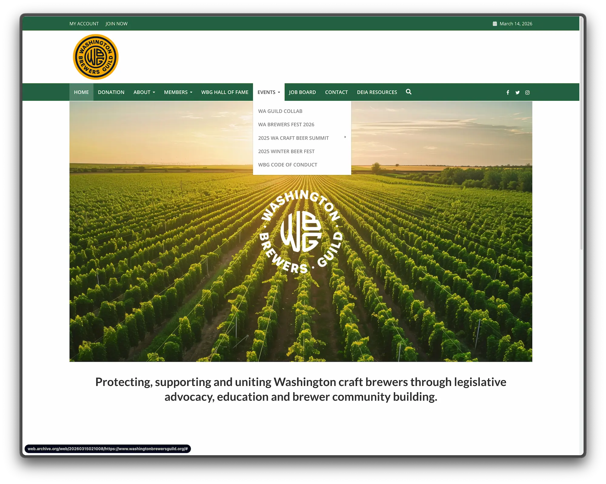
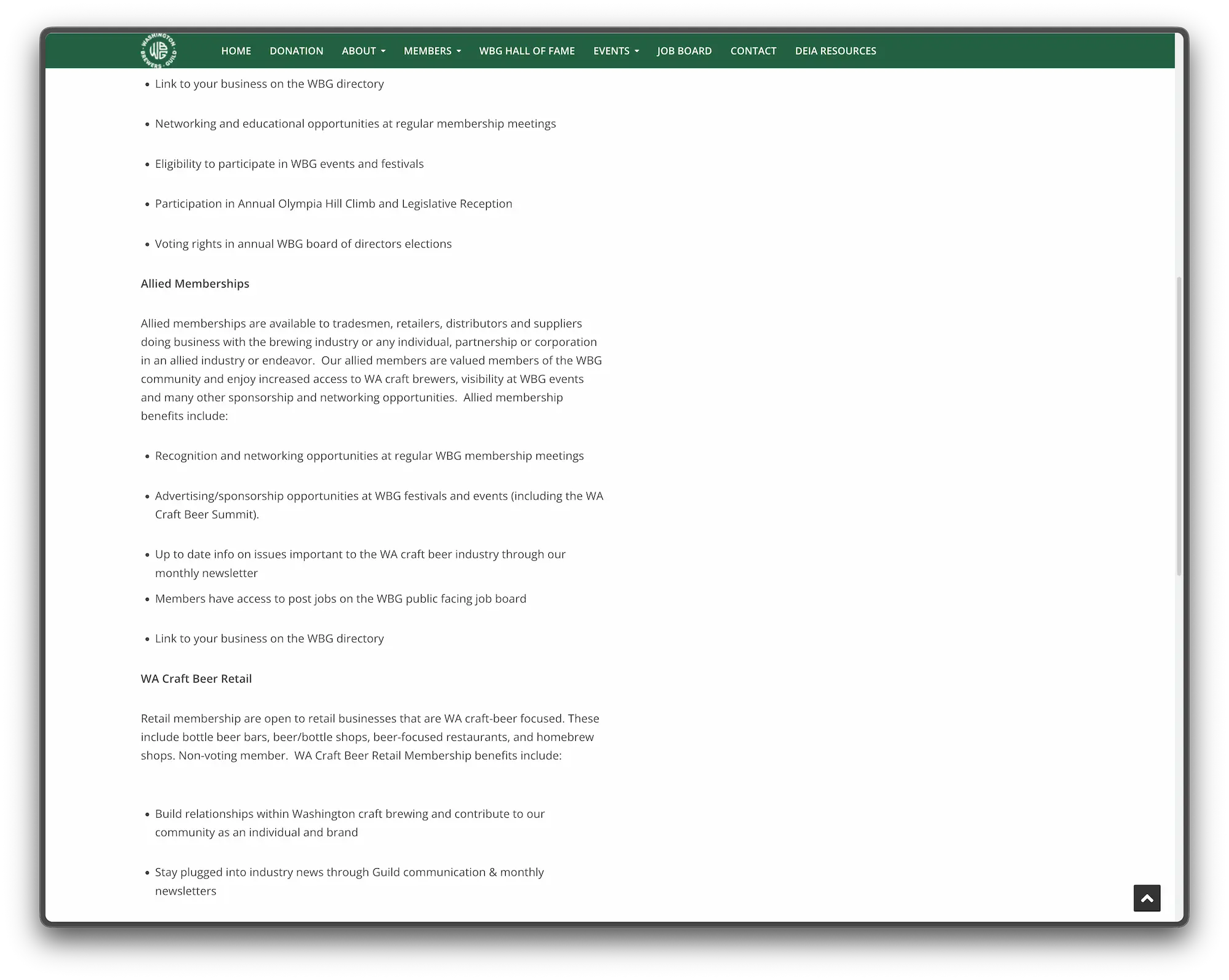
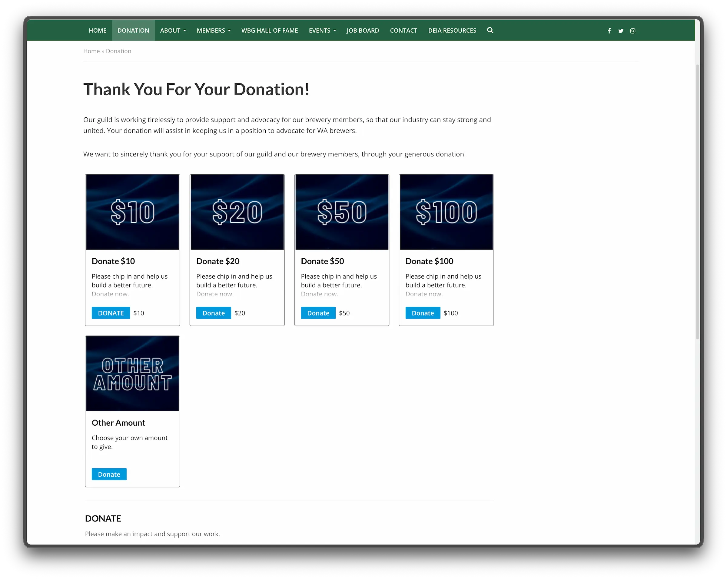
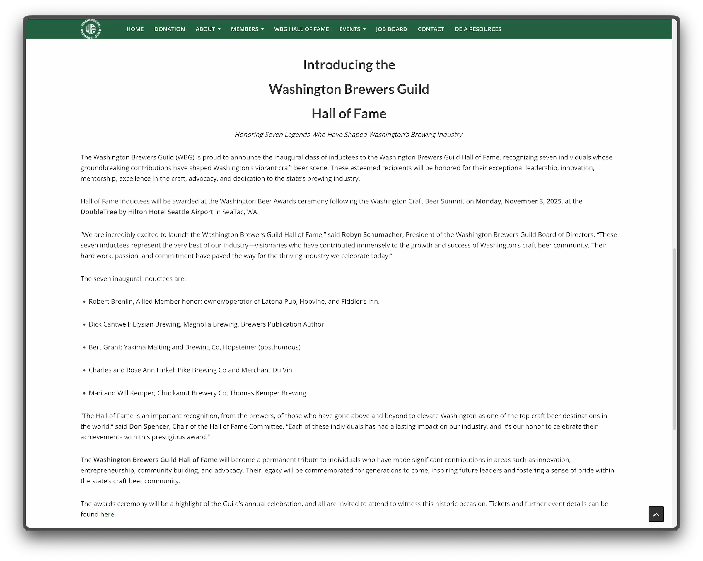
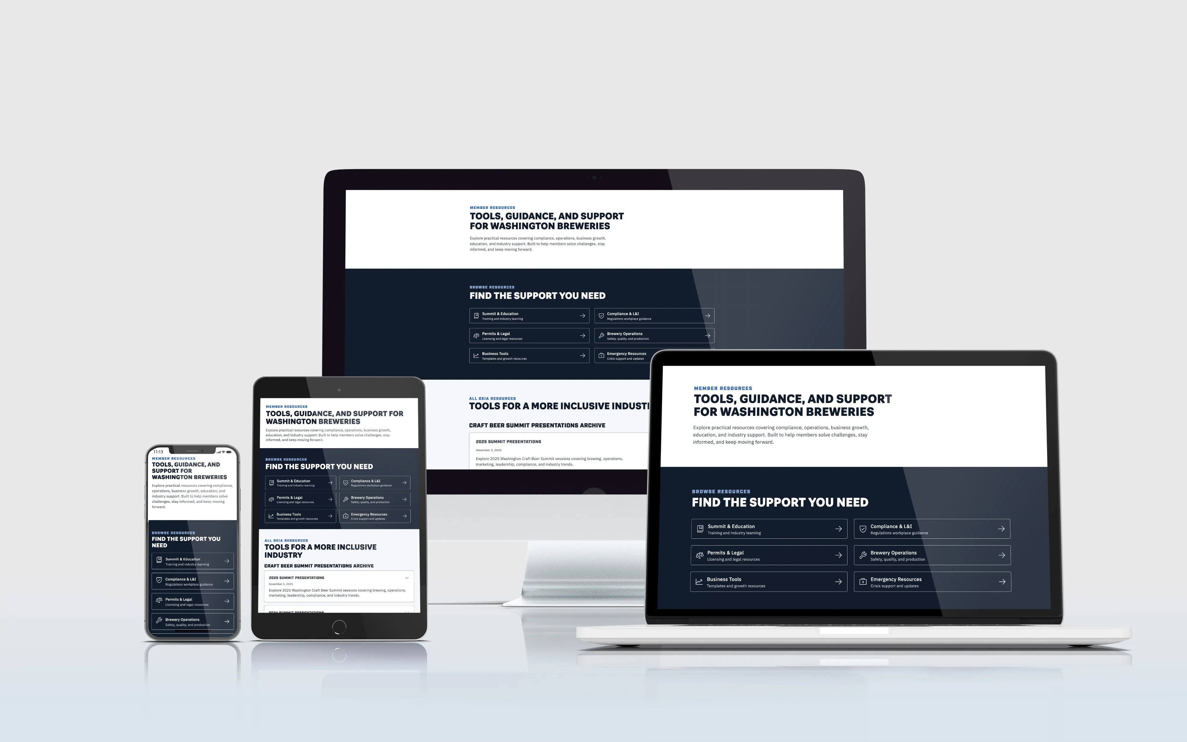
A full website rebuild for a 300+ member statewide brewers' association, replacing a legacy site with a CMS-driven system Guild staff could manage on their own. The new site covers events, resources, and member content that needed to grow over time.

Client
Washington Brewers Guild

My Role
UX Designer, Web Designer, Webflow Developer

Timeline
January 2026 – May 2026

Tools Used
Figma, Webflow, Illustrator, Photoshop, GSAP
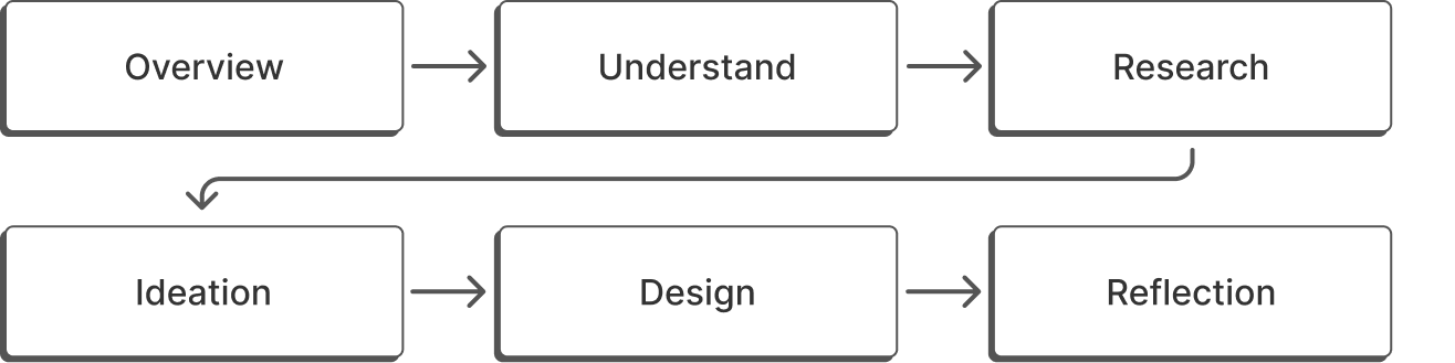
Design Process

My Impact
Led end-to-end redesign from strategy through implementation and launch.
Built a scalable CMS with collections for events and resources, so non-technical staff could manage content updates without developer support.
Reorganized navigation and page hierarchy to simplify how visitors find information.
Built client trust that led to an ongoing retainer for continued support beyond launch.